React dashboard components — API lookup, code generation, and prop validation for AI tools.
Quick Install
Automated & IDE SetupCopy the AI prompt to install this server into Claude Code, Cursor, or another agent — or use 1-click editor setup below.
Not yet automatically verified
We haven't yet run this listing's install command through our automated sandbox check. This isn't a red flag — we're steadily working through the catalog.
Manual Client & Custom JSON ConfigExpand JSON ▾
Client Config & Setup
Choose your client or environment
Target File:
💡 Paste the JSON block into your client's configuration file under mcpServers, then restart the application.
Documentation Overview

MetricUI
The missing UI layer for React dashboards.
KPI cards, charts, tables, and layout — with built-in formatting, theming, data states, and zero config.
Homepage · Docs · Analytics Demo · SaaS Demo · GitHub Demo · Wikipedia Live · MCP Server · Roadmap
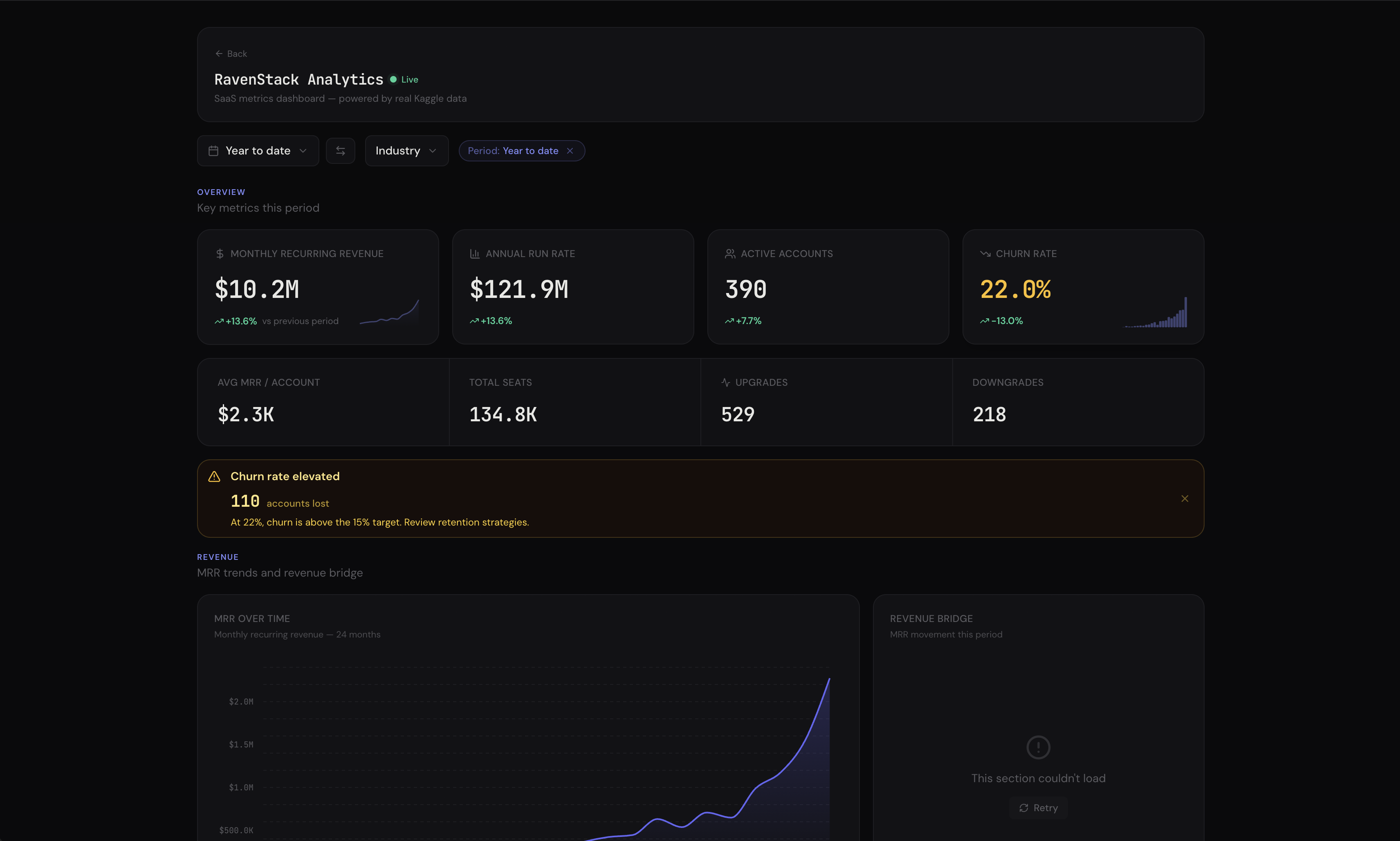
Web Analytics · SaaS Metrics · GitHub Analytics · Wikipedia Live · World Explorer — all with AI Insights, cross-filtering, drill-downs, and export.
Install
That's it. All chart dependencies are included.
CDN (no bundler needed)
For browser sandboxes, Claude artifacts, v0, Bolt, or anywhere without npm:
Why MetricUI?
You're building a dashboard. You need KPI cards, charts, tables. You reach for Recharts + shadcn + custom CSS and spend days wiring up formatting, dark mode, loading states, and responsive layouts.
Stop assembling dashboards from parts.
Zero layout code. <Dashboard> wraps all providers (theme, filters, cross-filter, drill-down, linked hover) in one component. MetricGrid auto-detects component types — KPIs row up, charts pair, tables go full width. DashboardHeader shows live status with auto-ticking "Updated Xm ago". Responsive out of the box.
Features
AI Insights — Bring Your Own LLM
Drop <DashboardInsight /> into any dashboard. A floating chat button appears — click it, ask questions about your data. The AI auto-collects live data from every component, builds context-rich prompts, and streams analysis. Use @ to reference specific charts. Works with any LLM (OpenAI, Anthropic, local models). Docs →
KPI Cards — Not Just Numbers
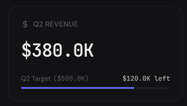
Sparkline with previous-period overlay. Goal progress bars. Conditional red/amber/green coloring. Multiple comparison badges. Copyable values. Drill-down links. Docs →
Headline Numbers on Any Chart
Every chart and table accepts a headline prop — a summary number in the card header that gives you the punchline at a glance.
Supports formatting, comparison badges with trend arrows, and conditional coloring — same features as KpiCard, right in the chart header.
Charts with Reference Lines & Threshold Bands
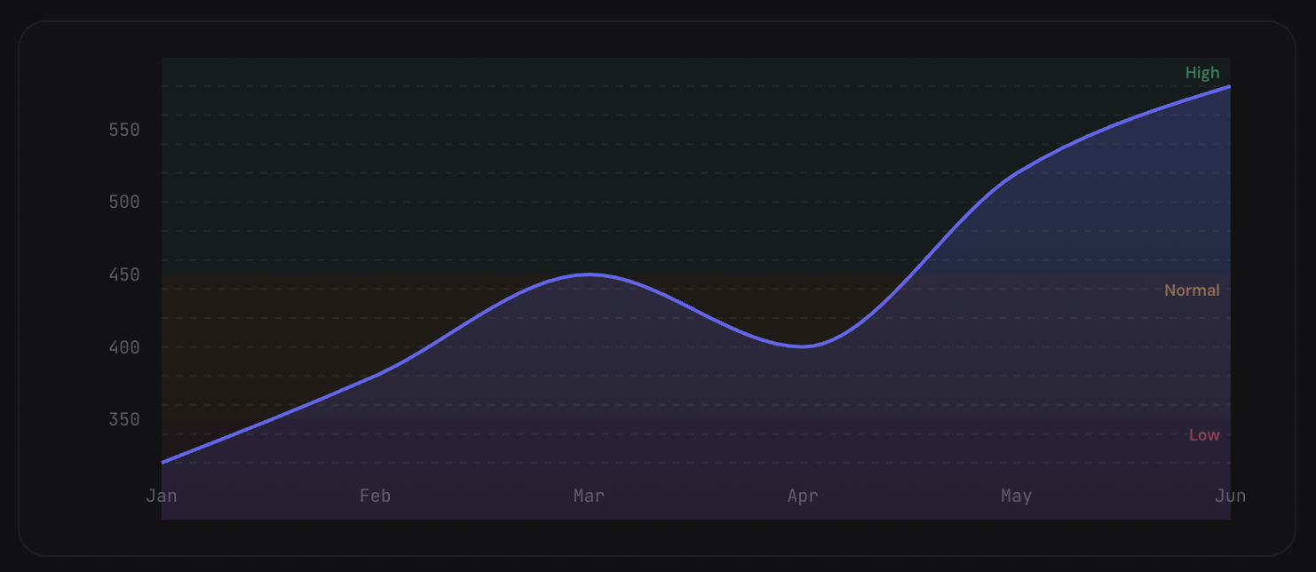
Mark targets, benchmarks, and danger zones directly on charts. Comparison overlays show period-over-period trends as dashed lines. Works on AreaChart, LineChart, and BarChart.
Data-Driven Alerts
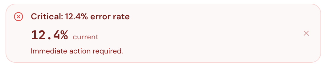
Pass a value and rules — Callout auto-selects the right variant, title, and message. Supports embedded formatted metrics, action buttons, collapsible detail, and auto-dismiss.
Expandable Data Tables
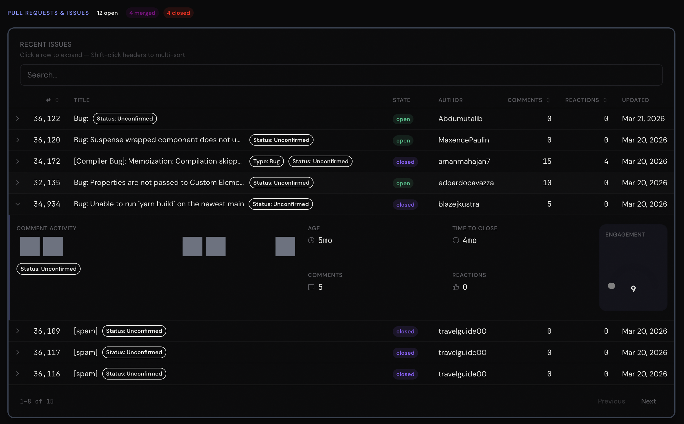
Click a row and a mini-dashboard slides open — sparklines, gauges, status indicators, badges. Plus search, multi-sort, pagination, pinned columns, 12 column types, and row conditions. Docs →
Conversion Funnels
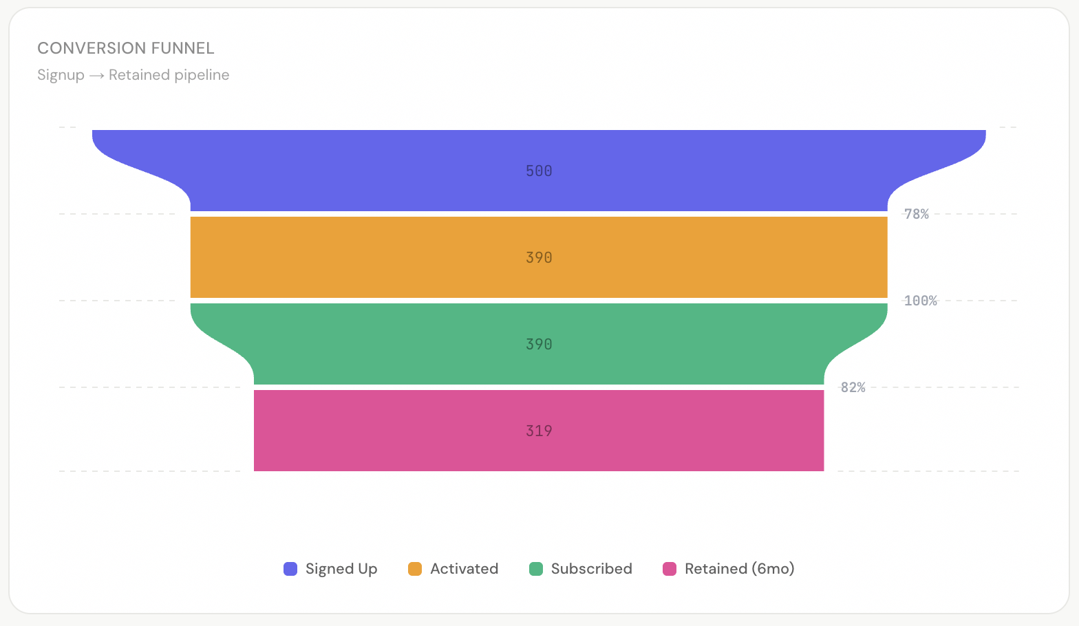
Auto-computed stage-to-stage conversion rates. Vertical or horizontal. Smooth or linear interpolation. Docs →
Light & Dark Mode
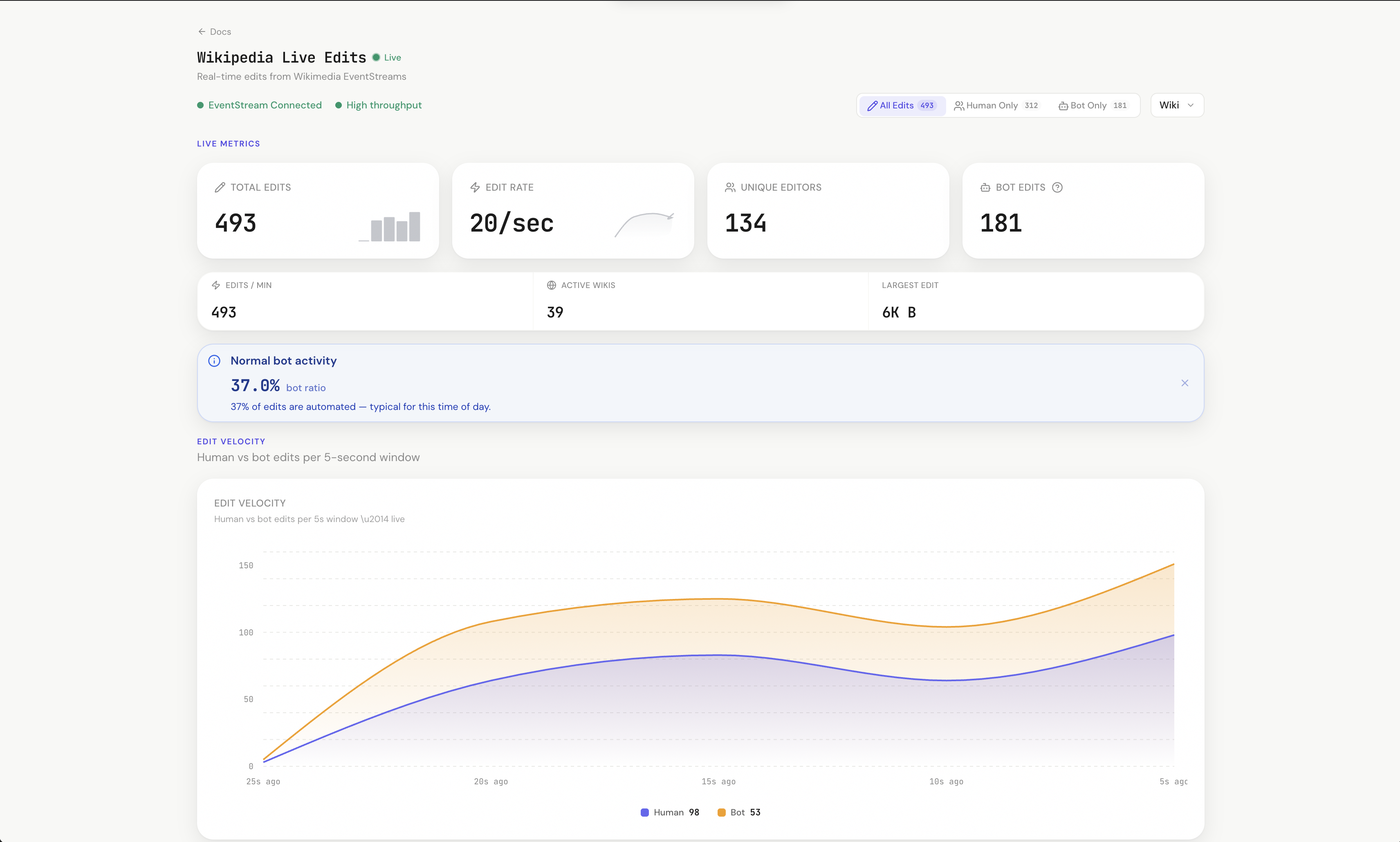
Wikipedia live demo in light mode.
CSS variables. Zero config. Every component adapts automatically. Theming guide →
Smart Format Engine
One prop formats any value. Currency, percentages, durations, compact notation — with locale support. Docs →
Theme Presets
One prop. Entire dashboard changes color. 8 built-in presets. Custom presets via ThemePreset type. Theming guide →
MetricGrid — Zero Layout Code
Drop components in. It figures out the layout. Docs →
Filter System
Related MCP Servers
Reviews
No reviews yet — be the first to share how this listing worked for you.
Frequently Asked Questions about Metricui
AllMCPs Directory Badge
Showcase your server listing on GitHub or your project documentation. Embed this dynamic SVG badge to highlight official listing status and live engagement.
Badge Style:
Live Dynamic SVG Preview
Markdown (GitHub README)
[](https://allmcps.com/mcp/metricui)HTML Embed
<a href="https://allmcps.com/mcp/metricui"><img src="https://allmcps.com/api/badge/metricui?style=directory" alt="Metricui on AllMCPs" /></a>Technical Specs & Signals
CategoryDeveloper Tools
37Quality signal: Fair · 37/100How this signal is calculated ▾
Server availabilityNot measured
Not scored for repo-hosted servers — we can't reach the running server, only its GitHub page. Hosted MCP endpoints are health-checked live.
Verified ownership10/20
Documentation & tools16/30
Adoption & activity2/15
Community engagement0/10
A guidance signal from public completeness & health data — not a user rating. New listings start lower and rise as they add docs, get verified, and grow adoption. Signals we can't observe for a listing are skipped, not counted against it.
Own this project?
This directory is pre-filled from public sources. Claim via GitHub README, site badge, or DNS TXT to unlock edit access and the Official badge — proof is checked automatically, then reviewed by our team.
Free dofollow backlink: add your website and place the AllMCPs badge on it — no claim needed. We detect it automatically and keep it verified as long as the badge stays live.
Claim & get free dofollowShare & Embed
Add our SVG badge (dark/light directory styles) or embeddable widget to your site.