Answers questions about liquefy-ui from its real API surface, so an agent stops inventing props.
Quick Install
Automated & IDE SetupCopy the AI prompt to install this server into Claude Code, Cursor, or another agent — or use 1-click editor setup below.
Not yet automatically verified
We haven't yet run this listing's install command through our automated sandbox check. This isn't a red flag — we're steadily working through the catalog.
Manual Client & Custom JSON ConfigExpand JSON ▾
Client Config & Setup
Choose your client or environment
Target File:
💡 Paste the JSON block into your client's configuration file under mcpServers, then restart the application.
Documentation Overview

A TypeScript UI library that delivers highly transparent Liquid Glass through WebGL optics, physical springs, and accessible React primitives.
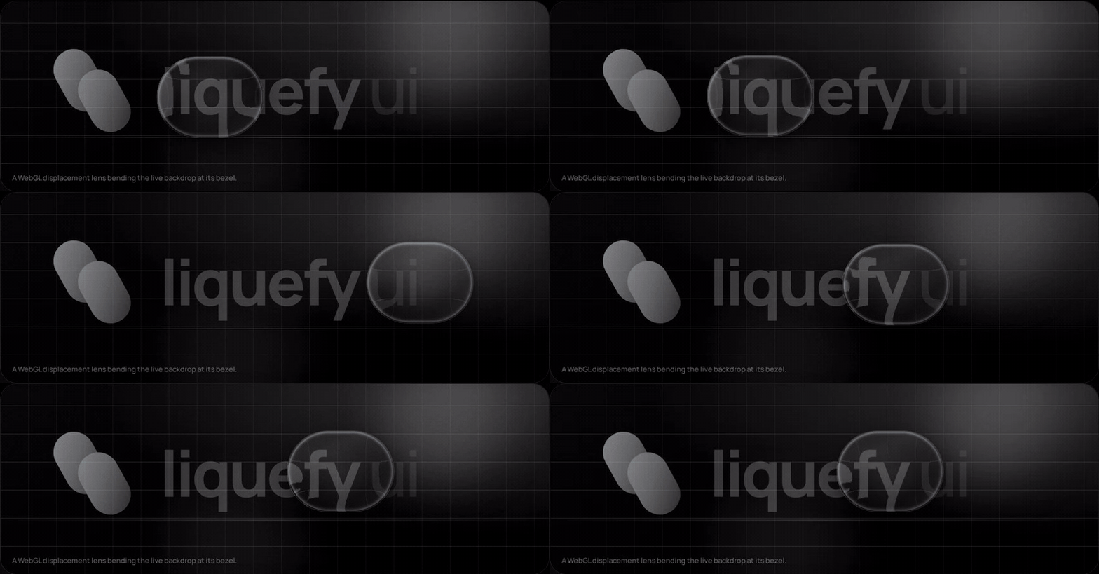
This is an independent open-source project and is not affiliated with Apple Inc. It references public design principles while providing an original implementation for the web.
Nothing above is a video effect: that is a WebGL displacement map applied to the
live backdrop through backdrop-filter, and the way the shape stretches and
overshoots is a spring reading pointer velocity. Both are on by default. Drag it
yourself at liquefy-ui.com, which also hosts the
component reference and the shadcn registry.
Packages
| Package | Purpose |
|---|---|
@liquefy-ui/react | React components, themes, and provider |
@liquefy-ui/core | Dependency-free WebGL, springs, and motion |
@liquefy-ui/icons | Tree-shakeable React SVG icons |
@liquefy-ui/mcp | MCP server that answers component questions from the real API |
Quick start
Next.js and React Server Components
Every component needs state, refs or the WebGL lens, so the whole package sits on
the client side of an RSC boundary. The published bundles carry a 'use client'
directive, so importing them straight into a server component works — no wrapper
file needed. Only event handlers have to move: a function cannot cross from a
server component into a client one, so anything with onClick or local state
belongs in its own 'use client' component.
apps/next-example is a working Next.js 16 App Router app whose page is a server
component, and its build runs in CI. If the client boundary ever regresses, that
build fails rather than yours.
Tailwind CSS v4
Import tailwind.css instead of styles.css, before Tailwind itself:
That declares the cascade layer order — so className="rounded-full" on a
LiquidButton actually wins — and bridges the --lq-* tokens into Tailwind's
theme as bg-liquid-accent, text-liquid-muted, rounded-liquid,
shadow-liquid, ease-liquid and friends. The bridge uses @theme inline, which
is what keeps those utilities resolving per-theme at use time.
For coding agents
| What | Where |
|---|---|
| MCP server | claude mcp add liquefy-ui -- npx -y @liquefy-ui/mcp — eight tools answering from the real exports, no network, no dependencies |
llms.txt | /llms.txt and /llms-full.txt, generated from source |
| One page per component | /llms/liquid-button.md, plus icons.md, core.md and mcp.md — plain Markdown, because the docs site is a hash-routed SPA that a fetcher without JavaScript cannot read |
| shadcn registry | npx shadcn@latest add @liquefy-ui/liquid-button — the namespace is in shadcn's registry directory, so it needs no components.json entry |
The MCP tools are get_conventions, list_components, get_component,
search_components, get_component_source, get_tokens, list_icons and
get_core_api. The catalog behind them is generated from source at build time, and
lists only names the package entry point re-exports — so an agent is never told to
import something that does not resolve.
The registry copies real component source into your project rather than a
re-export, with imports rewritten to @/components/ui, @/lib and @/hooks. The
copied tree keeps @liquefy-ui/core and @base-ui/react from npm but not
@liquefy-ui/react, so a copied LiquefyProvider never ends up competing with the
packaged one. Every copied file is written with its own 'use client' directive, so an
RSC app needs no follow-up edit.
Documentation
Everything is on liquefy-ui.com:
| Route | Contents |
|---|---|
#/ | The playground first, then framework and agent-tooling compatibility, then component samples |
#/playground | Every LiquefyProvider prop as a live control, applied to the whole site |
#/components | Index of every component, each with live demos and a full prop table |
#/docs | Introduction, installation, provider, theming, the styles prop, motion |
#/docs/frameworks · #/docs/tailwind · #/docs/ai-tooling | Integration |
#/docs/accessibility · #/docs/performance · #/docs/troubleshooting | Practices |
Old #/guides/* links redirect to their #/docs/* equivalents.
Style overrides: the styles prop
Every component takes a styles prop for one-off overrides, so reaching for a
stylesheet is optional. It is a superset of style:
| Feature | Notes |
|---|---|
| CSS properties | Every camelCase property, plus --custom-properties. Numbers become px, matching style. |
| Spacing shorthands | p, px, py, pt/pr/pb/pl, and the m equivalents. Numbers count --lq-space units (4px by default, set spacing on the provider). gap and friends use the same scale. |
| Other shorthands | w, h, size, minW/maxW/minH/maxH, bg, radius. radius drives --lq-radius, so the press-squish keeps animating the corners. |
| Tokens | $name anywhere in a string resolves to var(--lq-name). Colour properties also accept the bare words accent, tint, foreground, muted, placeholder, text, line. |
| Responsive | { base, sm, md, lg, xl }, ordered ascending no matter how you write it. Override the widths with breakpoints on LiquefyProvider. |
| States | _hover, _focus, _focusVisible, _active, _disabled, _checked, _selected, _expanded, _open, _invalid, _readOnly, _placeholder, _first, _last, _odd, _even, and _dark / _light (which cover both the explicit theme and theme="system"). |
Static values ride the style attribute, so the common case adds no stylesheet
and no hydration concerns. As soon as a state or breakpoint appears, the whole
object moves into a generated class instead — otherwise the inline declarations
would outrank the very rules meant to override them. That class is inserted
unlayered, and the component stylesheet lives in @layer liquefy-ui, so
overrides win on cascade order rather than on !important or specificity.
Precedence is styles over the component's own custom properties, and style
over everything — style stays the last-resort escape hatch.
transform and backdrop-filter are written inline by the jelly springs every
frame and cannot be overridden through styles; development builds warn if you
try. Wrap the component and style the wrapper instead.
Building your own component on the same system:
Server rendering: useInsertionEffect does not run on the server, so flush the
collected rules into the document head yourself with getLiquefyStyleSheet().
Static-only styles need nothing — they are already inline.
LiquefyProvider takes className and style but not styles — it owns the
config that styles reads. LiquidToastProvider takes none of the three: it
renders no root element of its own, only the toast viewport. slotStyles is reserved for per-part styling
({ header, body, footer }) and is not implemented yet.
The full version of this — every shorthand, token reference, breakpoint and state
key, plus custom components and server rendering — is at #/docs/styles-prop,
with the token system itself at #/docs/theming.
Components
33 components and 44 icons, each with live demos and a full prop table at liquefy-ui.com/#/components.
Related MCP Servers
Reviews
No reviews yet — be the first to share how this listing worked for you.
Frequently Asked Questions about Liquefy Ui
AllMCPs Directory Badge
Showcase your server listing on GitHub or your project documentation. Embed this dynamic SVG badge to highlight official listing status and live engagement.
Badge Style:
Live Dynamic SVG Preview
Markdown (GitHub README)
[](https://allmcps.com/mcp/liquefy-ui)HTML Embed
<a href="https://allmcps.com/mcp/liquefy-ui"><img src="https://allmcps.com/api/badge/liquefy-ui?style=directory" alt="Liquefy Ui on AllMCPs" /></a>Technical Specs & Signals
CategoryDeveloper Tools
37Quality signal: Fair · 37/100How this signal is calculated ▾
Server availabilityNot measured
Not scored for repo-hosted servers — we can't reach the running server, only its GitHub page. Hosted MCP endpoints are health-checked live.
Verified ownership10/20
Documentation & tools16/30
Adoption & activity2/15
Community engagement0/10
A guidance signal from public completeness & health data — not a user rating. New listings start lower and rise as they add docs, get verified, and grow adoption. Signals we can't observe for a listing are skipped, not counted against it.
Own this project?
This directory is pre-filled from public sources. Claim via GitHub README, site badge, or DNS TXT to unlock edit access and the Official badge — proof is checked automatically, then reviewed by our team.
Free dofollow backlink: add your website and place the AllMCPs badge on it — no claim needed. We detect it automatically and keep it verified as long as the badge stays live.
Claim & get free dofollowShare & Embed
Add our SVG badge (dark/light directory styles) or embeddable widget to your site.