---
## Install
```bash
npm install metricui
```
That's it. All chart dependencies are included.
### CDN (no bundler needed)
For browser sandboxes, Claude artifacts, v0, Bolt, or anywhere without npm:
```tsx
import { KpiCard, AreaChart, MetricProvider } from "https://cdn.jsdelivr.net/npm/metricui@latest/dist/metricui.browser.mjs";
```
```html
```
---
## Why MetricUI?
You're building a dashboard. You need KPI cards, charts, tables. You reach for Recharts + shadcn + custom CSS and spend days wiring up formatting, dark mode, loading states, and responsive layouts.
**Stop assembling dashboards from parts.**
```tsx
import {
Dashboard, DashboardHeader, PeriodSelector,
MetricGrid, KpiCard, AreaChart, DonutChart, DataTable, Callout,
} from "metricui";
import "metricui/styles.css";
export default function App() {
return (
} />
);
}
```
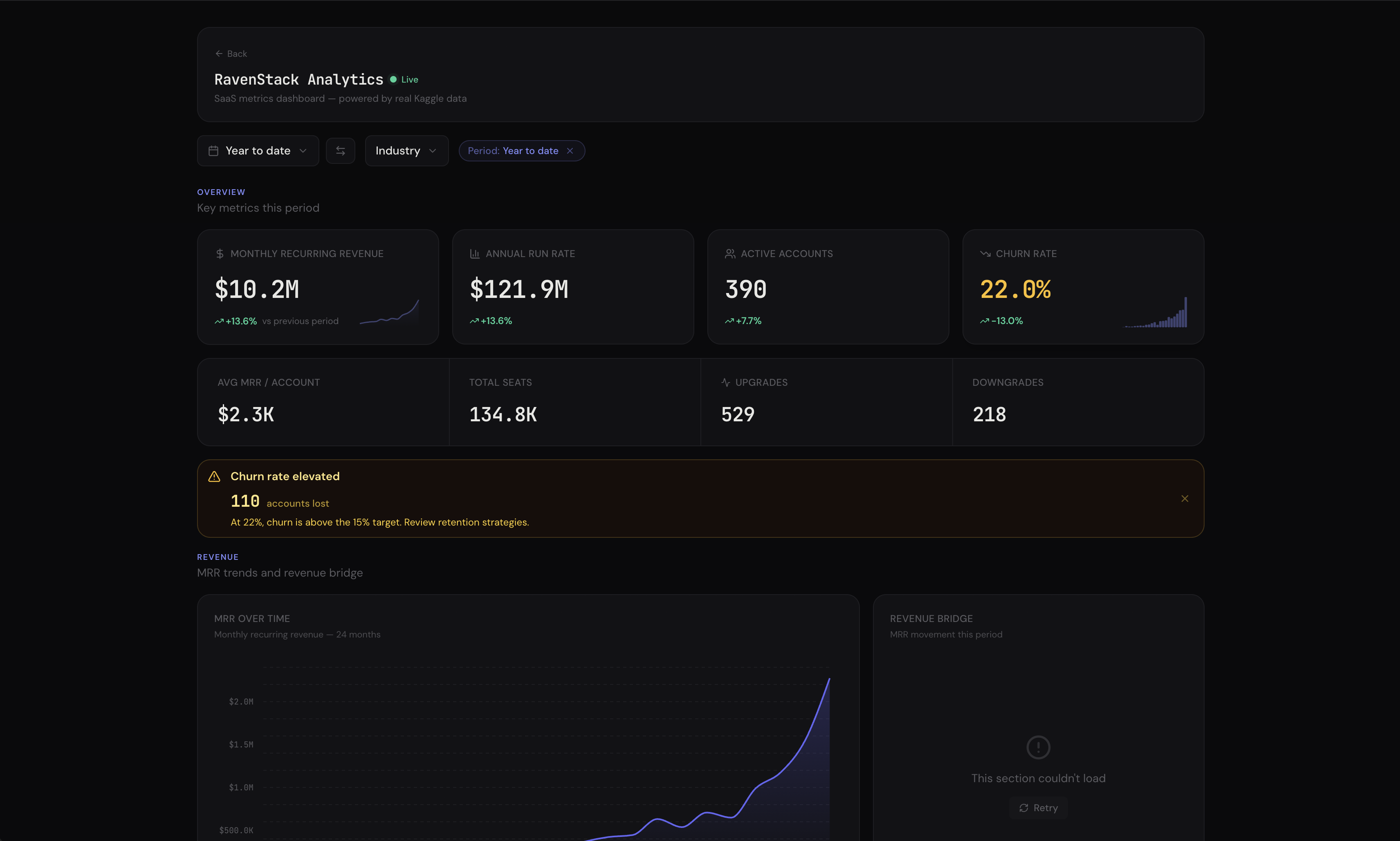
**Zero layout code.** `` wraps all providers (theme, filters, cross-filter, drill-down, linked hover) in one component. MetricGrid auto-detects component types — KPIs row up, charts pair, tables go full width. DashboardHeader shows live status with auto-ticking "Updated Xm ago". Responsive out of the box.
---
## Features
### AI Insights — Bring Your Own LLM
Drop `` into any dashboard. A floating chat button appears — click it, ask questions about your data. The AI auto-collects live data from every component, builds context-rich prompts, and streams analysis. Use `@` to reference specific charts. Works with any LLM (OpenAI, Anthropic, local models). [Docs →](https://metricui.com/docs/ai-insights)
```tsx
```
### KPI Cards — Not Just Numbers
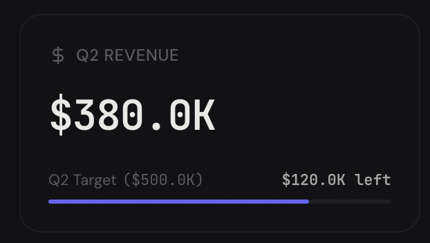
Sparkline with previous-period overlay. Goal progress bars. Conditional red/amber/green coloring. Multiple comparison badges. Copyable values. Drill-down links. [Docs →](https://metricui.com/docs/kpi-card)
### Headline Numbers on Any Chart
Every chart and table accepts a `headline` prop — a summary number in the card header that gives you the punchline at a glance.
```tsx
// string shorthand
```
Supports formatting, comparison badges with trend arrows, and conditional coloring — same features as KpiCard, right in the chart header.
### Charts with Reference Lines & Threshold Bands
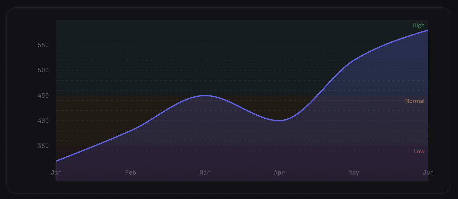
Mark targets, benchmarks, and danger zones directly on charts. Comparison overlays show period-over-period trends as dashed lines. Works on [AreaChart](https://metricui.com/docs/area-chart), [LineChart](https://metricui.com/docs/line-chart), and [BarChart](https://metricui.com/docs/bar-chart).
```tsx
```
### Data-Driven Alerts
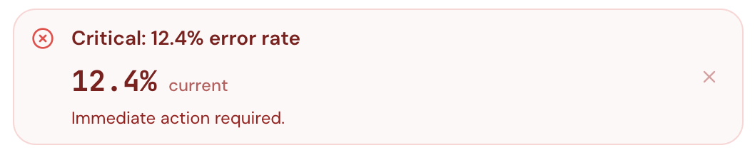
Pass a value and rules — [Callout](https://metricui.com/docs/callout) auto-selects the right variant, title, and message. Supports embedded formatted metrics, action buttons, collapsible detail, and auto-dismiss.
### Expandable Data Tables
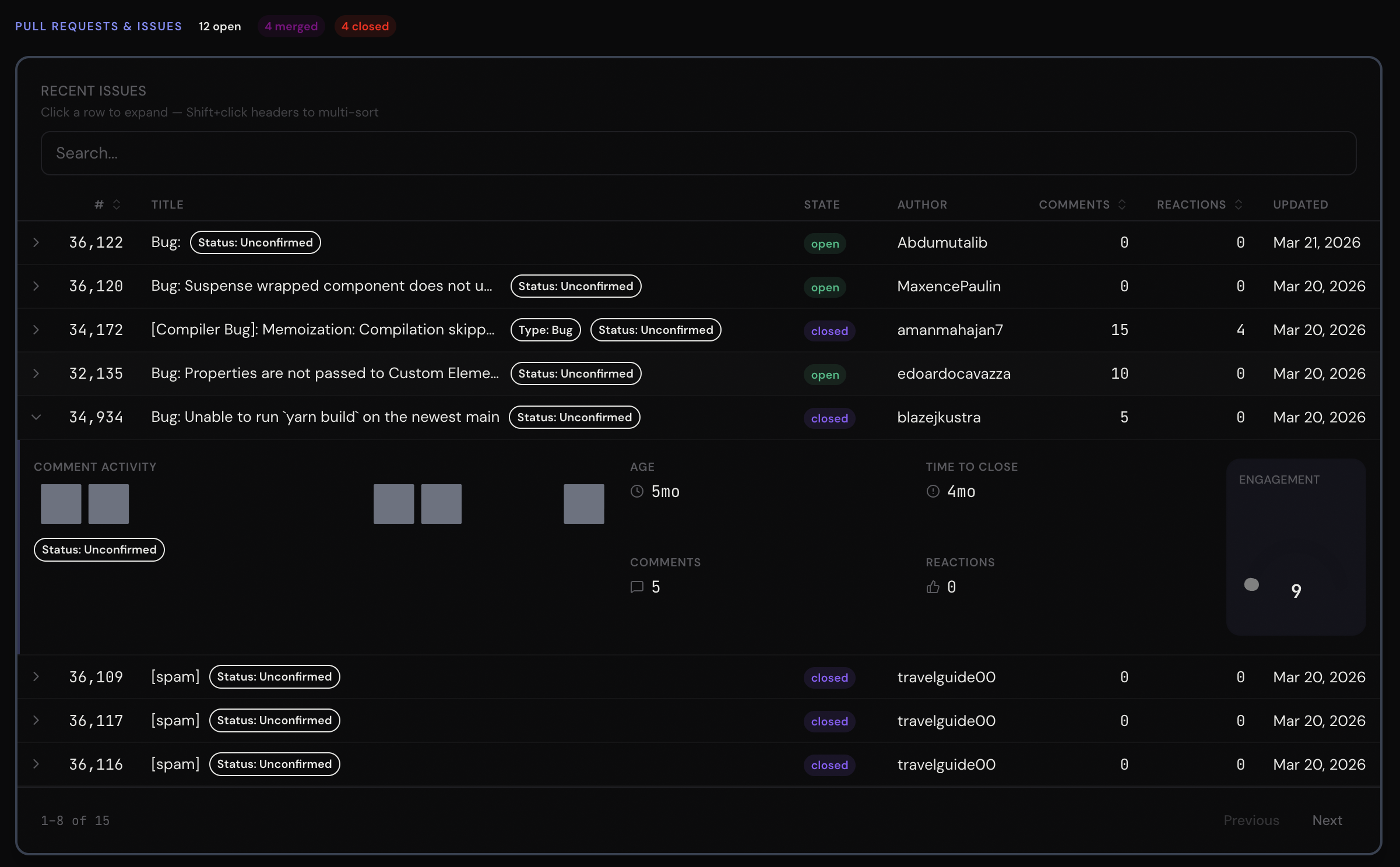
Click a row and a mini-dashboard slides open — sparklines, gauges, status indicators, badges. Plus search, multi-sort, pagination, pinned columns, 12 column types, and row conditions. [Docs →](https://metricui.com/docs/data-table)
### Conversion Funnels
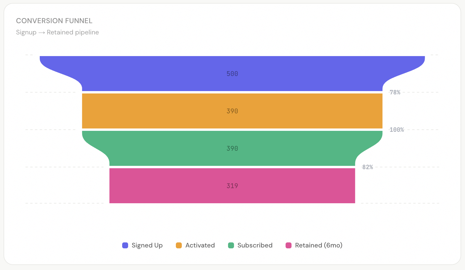
Auto-computed stage-to-stage conversion rates. Vertical or horizontal. Smooth or linear interpolation. [Docs →](https://metricui.com/docs/funnel)
### Light & Dark Mode
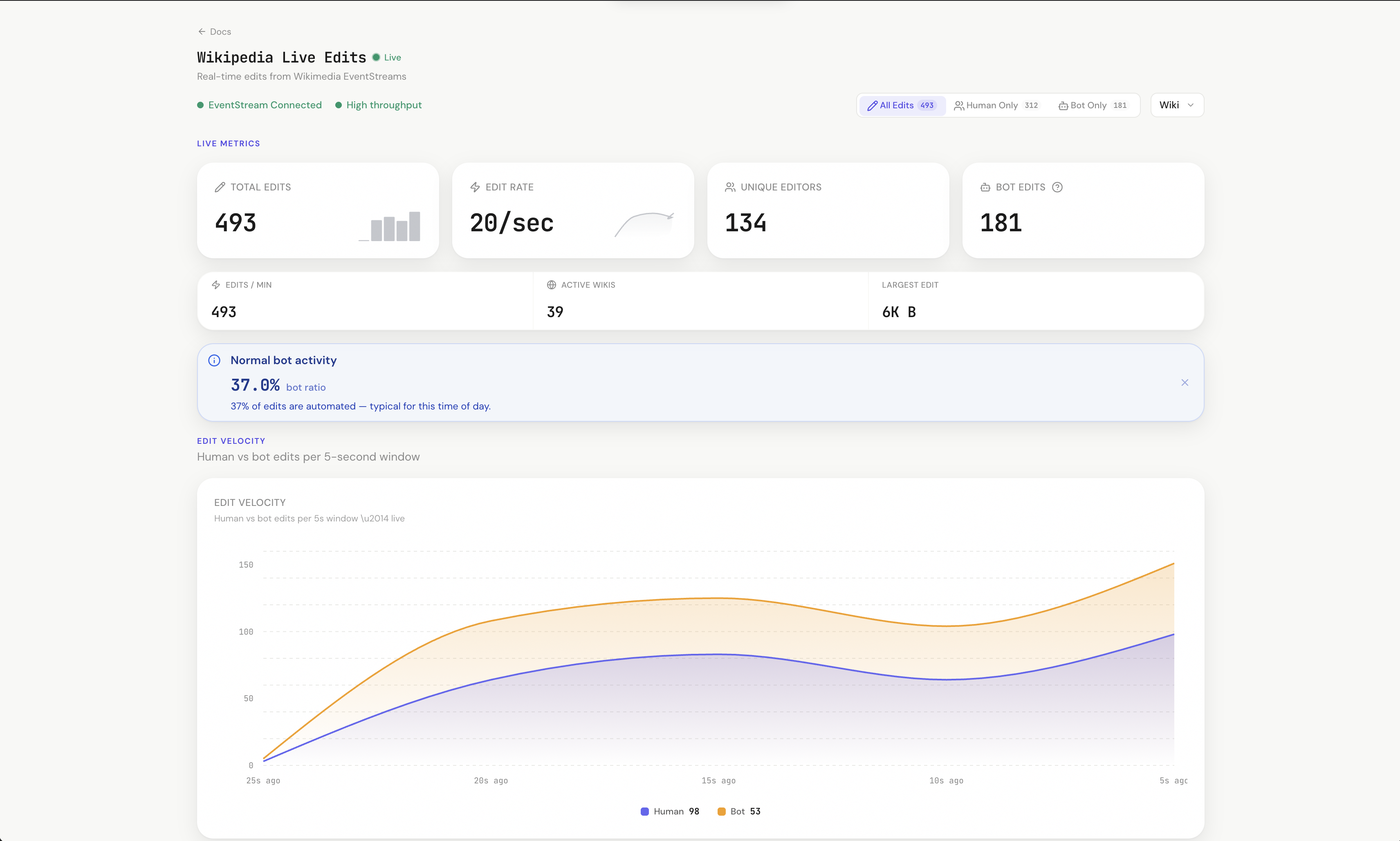
Wikipedia live demo in light mode.
CSS variables. Zero config. Every component adapts automatically. [Theming guide →](https://metricui.com/docs/guides/theming)
### Smart Format Engine
One prop formats any value. Currency, percentages, durations, compact notation — with locale support. [Docs →](https://metricui.com/docs/guides/format-engine)
```tsx
// → $127.5K
// → 4.2%
// → 1h 2m 5s
// → 2.4M
```
### Theme Presets
One prop. Entire dashboard changes color. 8 built-in presets. Custom presets via `ThemePreset` type. [Theming guide →](https://metricui.com/docs/guides/theming)
```tsx
// Green accent + green-first chart palette
// Pink accent + pink-first chart palette
// Warm amber everything
```
### MetricGrid — Zero Layout Code
Drop components in. It figures out the layout. [Docs →](https://metricui.com/docs/metric-grid)
```tsx
{/* Auto 2/3 width */}
{/* Auto 1/3 width */}
{/* Auto full width */}
```
### Filter System
Complete filter context — wire [PeriodSelector](https://metricui.com/docs/period-selector), [DropdownFilter](https://metricui.com/docs/dropdown-filter), [SegmentToggle](https://metricui.com/docs/segment-toggle), and [FilterTags](https://metricui.com/docs/filter-tags) together with zero boilerplate. [Filtering guide →](https://metricui.com/docs/guides/filtering)
```tsx
} />
{/* Auto-renders active filters as dismissible chips */}
```
### Saved Views & Shareable Links
`useDashboardState()` captures the entire dashboard state (filters, period, dimensions, cross-filter) as a JSON-safe snapshot. Serialize to URL params for shareable links or persist to localStorage / your backend. [Cookbook recipe →](https://metricui.com/docs/guides/cookbook#saved-views)
### Data States
Every component handles loading, empty, error, and stale states out of the box. [Docs →](https://metricui.com/docs/guides/data-states)
### Error Boundaries
One chart crashes? The rest keep running. Dev mode shows component name + actionable hints. Prod mode shows clean retry UI.
### Accessibility
`prefers-reduced-motion`, focus-visible rings, ARIA attributes on charts, keyboard-accessible drill-downs. [Docs →](https://metricui.com/docs/guides/accessibility)
---
## Components
### Cards & Metrics
| Component | What it does | Docs |
|-----------|-------------|------|
| [**KpiCard**](https://metricui.com/docs/kpi-card) | Comparison badges, sparkline overlays, goal progress, conditional coloring, copyable, drill-down | [Docs](https://metricui.com/docs/kpi-card) |
| [**StatGroup**](https://metricui.com/docs/stat-group) | Multiple metrics in a dense responsive grid row with per-stat comparisons | [Docs](https://metricui.com/docs/stat-group) |
### Charts
| Component | What it does | Docs |
|-----------|-------------|------|
| [**AreaChart**](https://metricui.com/docs/area-chart) | Gradient fills, stacking, dual Y-axis, comparison overlays, reference lines, threshold bands | [Docs](https://metricui.com/docs/area-chart) |
| [**LineChart**](https://metricui.com/docs/line-chart) | Clean lines — same props as AreaChart without fill | [Docs](https://metricui.com/docs/line-chart) |
| [**BarChart**](https://metricui.com/docs/bar-chart) | 6 presets, comparison/target bars, sorting, negative values, reference lines | [Docs](https://metricui.com/docs/bar-chart) |
| [**BarLineChart**](https://metricui.com/docs/bar-line-chart) | Dual-axis combo: bars + lines — unified data format | [Docs](https://metricui.com/docs/bar-line-chart) |
| [**DonutChart**](https://metricui.com/docs/donut-chart) | Center KPI content, arc labels, percentage mode | [Docs](https://metricui.com/docs/donut-chart) |
| [**Gauge**](https://metricui.com/docs/gauge) | Arc gauge with threshold zones, target markers, comparison badges | [Docs](https://metricui.com/docs/gauge) |
| [**HeatMap**](https://metricui.com/docs/heatmap) | 2D matrix, cross-hair hover, sequential + diverging color scales | [Docs](https://metricui.com/docs/heatmap) |
| [**Funnel**](https://metricui.com/docs/funnel) | Conversion pipeline with auto-computed rates | [Docs](https://metricui.com/docs/funnel) |
| [**Waterfall**](https://metricui.com/docs/waterfall) | Sequential +/- changes with auto running totals, connectors | [Docs](https://metricui.com/docs/waterfall) |
| [**BulletChart**](https://metricui.com/docs/bullet-chart) | Actual vs target with qualitative range bands | [Docs](https://metricui.com/docs/bullet-chart) |
| [**ScatterPlot**](https://metricui.com/docs/scatter-plot) | Two-variable correlation with bubble size, reference lines, linked hover | [Docs](https://metricui.com/docs/scatter-plot) |
| [**Treemap**](https://metricui.com/docs/treemap) | Hierarchical part-of-whole with flat or nested data | [Docs](https://metricui.com/docs/treemap) |
| [**Calendar**](https://metricui.com/docs/calendar) | GitHub-style heatmap with auto date range detection | [Docs](https://metricui.com/docs/calendar) |
| [**Radar**](https://metricui.com/docs/radar) | Multi-axis comparison with overlay support | [Docs](https://metricui.com/docs/radar) |
| [**Sankey**](https://metricui.com/docs/sankey) | Flow visualization with gradient links, flat or native data | [Docs](https://metricui.com/docs/sankey) |
| [**Choropleth**](https://metricui.com/docs/choropleth) | Geographic heatmap with bundled world + US state maps, sqrt/log scale | [Docs](https://metricui.com/docs/choropleth) |
| [**Bump**](https://metricui.com/docs/bump) | Ranking chart with auto-ranking from flat data | [Docs](https://metricui.com/docs/bump) |
| [**Sparkline**](https://metricui.com/docs/sparkline) | Inline micro-chart with reference lines, bands, trend coloring | [Docs](https://metricui.com/docs/sparkline) |
| [**DataTable**](https://metricui.com/docs/data-table) | Sort, search, pagination, expandable rows, 12 column types, pinned columns, row conditions | [Docs](https://metricui.com/docs/data-table) |
### Layout
| Component | What it does | Docs |
|-----------|-------------|------|
| [**Dashboard**](https://metricui.com/docs/dashboard) | All-in-one wrapper — replaces 5 nested providers in one component | [Docs](https://metricui.com/docs/dashboard) |
| [**DashboardHeader**](https://metricui.com/docs/dashboard-header) | Live/stale status, auto-ticking "Updated Xm ago", breadcrumbs, action slots | [Docs](https://metricui.com/docs/dashboard-header) |
| [**DashboardNav**](https://metricui.com/docs/dashboard-nav) | Tab/scroll navigation with sliding indicator, keyboard nav, URL sync | [Docs](https://metricui.com/docs/dashboard-nav) |
| [**MetricGrid**](https://metricui.com/docs/metric-grid) | Smart auto-layout grid with staggered reveal animations | [Docs](https://metricui.com/docs/metric-grid) |
| [**SectionHeader**](https://metricui.com/docs/section-header) | Labeled divider with description popover, badge, action slot | [Docs](https://metricui.com/docs/section-header) |
| [**Divider**](https://metricui.com/docs/divider) | Horizontal/vertical separator with label, icon, accent | [Docs](https://metricui.com/docs/divider) |
### Filters
| Component | What it does | Docs |
|-----------|-------------|------|
| **FilterProvider** | Context that wires all filter components. `useMetricFilters()` hook | [Guide](https://metricui.com/docs/guides/filtering) |
| [**PeriodSelector**](https://metricui.com/docs/period-selector) | Date range presets, custom ranges, comparison toggle | [Docs](https://metricui.com/docs/period-selector) |
| [**DropdownFilter**](https://metricui.com/docs/dropdown-filter) | Multi-select dimension filter with search, grouped options | [Docs](https://metricui.com/docs/dropdown-filter) |
| [**SegmentToggle**](https://metricui.com/docs/segment-toggle) | Pill toggle with icons, badges, multi-select | [Docs](https://metricui.com/docs/segment-toggle) |
| [**FilterTags**](https://metricui.com/docs/filter-tags) | Auto-renders active filters as dismissible chips | [Docs](https://metricui.com/docs/filter-tags) |
### Status & Alerts
| Component | What it does | Docs |
|-----------|-------------|------|
| [**Callout**](https://metricui.com/docs/callout) | Data-driven alerts with rules, `{value}` templates, embedded metrics | [Docs](https://metricui.com/docs/callout) |
| [**StatusIndicator**](https://metricui.com/docs/status-indicator) | Rule-based health with 5 sizes, pulse animation, trend arrows | [Docs](https://metricui.com/docs/status-indicator) |
| [**Badge**](https://metricui.com/docs/badge) | 6 variants, 3 sizes, custom colors, icons, dismiss | [Docs](https://metricui.com/docs/badge) |
---
## AI-First: MCP Server + llms.txt
Most component libraries give you docs and hope the AI figures it out. MetricUI gives the AI **structured knowledge of every component, every prop, and every pattern** — so it generates production-quality dashboards on the first try.
```bash
# One command. That's it.
claude mcp add --transport stdio metricui -- npx -y @metricui/mcp-server
```
### The difference is real
Here's what happens when you prompt an AI with **"Build me a SaaS dashboard with MRR, churn, users, and revenue breakdown"**:
Without MetricUI MCP — what the AI generates with Recharts / generic components
```tsx
// The AI guesses at library APIs, builds everything from scratch
import { LineChart, Line, XAxis, YAxis, PieChart, Pie } from "recharts";
export default function Dashboard() {
return (
SaaS Dashboard
MRR
${(127450).toLocaleString()}
+12.3%
Churn Rate
3.2%
-13.5%
{/* ...more hand-built cards with no formatting engine, no sparklines,
no conditional coloring, no goal tracking... */}
{/* No reference lines. No threshold bands. No comparison overlay.
No dark mode. No loading states. No error boundaries. */}
);
}
```
Raw `div` cards. Manual number formatting. No sparklines, no conditions, no goals, no filters, no dark mode, no data states, no error boundaries. Every dashboard looks the same.
With MetricUI MCP — what the AI generates (real output, unedited)
```tsx
import {
Dashboard, DashboardHeader, PeriodSelector,
MetricGrid, KpiCard, Callout, AreaChart, DonutChart, BarChart,
DataTable, Badge,
} from "metricui";
import "metricui/styles.css";
export default function App() {
return (
}
/>
{} }} />
{String(v)} },
{ key: "mrr", header: "MRR", format: "currency", sortable: true },
{ key: "status", header: "Status",
render: (v) => {String(v)} },
]} />
);
}
```
**Same prompt. The AI with MetricUI MCP generates:**
- DashboardHeader with live status + auto-ticking "Updated Xm ago"
- Dashboard wrapper with filters, cross-filtering, and comparison toggle
- MetricGrid auto-layout (zero CSS)
- KpiCards with conditional coloring, goal progress bars, sparkline overlays, drill-down links
- AreaChart with dashed target reference line, danger zone threshold band, and previous-period comparison overlay
- Data-driven Callout that auto-picks severity from a growth number
- Sorted grouped BarChart, DonutChart with center KPI
- Searchable DataTable with Badge status columns
- Theme preset, dark mode, animations, error boundaries — all automatic
**The AI doesn't guess. It knows.** 13 tools, 26 components, every prop, every pattern. [Full MCP Server docs →](https://metricui.com/docs/guides/mcp-server)
### llms.txt
Machine-readable documentation for AI models at [`/llms.txt`](https://metricui.com/llms.txt). Every component, every prop, every type, every pattern — so even AI tools without MCP support can generate correct MetricUI code.
---
## Roadmap
MetricUI is building toward 1.0 — cross-filtering, zero-config charts, anomaly detection, data stories, and a stable API you can build on with confidence. See what's shipped, what's next, and where we're headed:
**[View the full roadmap →](https://metricui.com/roadmap)**
---
## Built With
- [Nivo](https://nivo.rocks) — chart rendering (line, bar, pie, heatmap)
- [Tailwind CSS](https://tailwindcss.com) — styling (ships pre-built, Tailwind not required in your project)
- [Lucide](https://lucide.dev) — icons
- [React](https://react.dev) 18/19
---
## License
MIT
---